FROM THE COMMUNITY COLLECTION
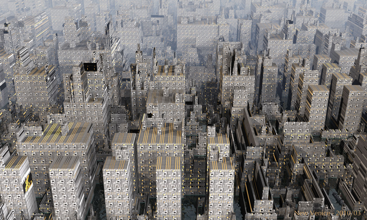
New Venice
The city blocks are a terrain, created with the DTE by David. The vessel in the wharf is from DAZ3D. Lit partly by a weak sun, and the Oilspill HDRI I once made from an artwork by David. Rendered with quality 64 and premium with 36 rpp. This is another Bryce 7 beta render.
Loading unique views4,330 unverified legacy hits3.0 archived rating2010-03-28 added
Comments 3
A conversation around the artworkSign in to join the conversation.
Cool Horo. I was just going to start a city scene very similar to yours. I'll see if I can do a good enough job to post it, lol. Great work.
Thank you David. I cannot deny that the material used is a bit "nervous". Good point about the waves in the wharf. This cityscape is one of yours. I've just started exploring this myself and I'm quite exited at the possibilities. Synchronizing the terrain with the material seems to be the real challenge. There is a lot to experiment with here.
Well, clearly, I can't help but be tempted to stick my oar in. The lighting looks good, but I feel the effect is overwhelmed by the choice of material. I have said it before, I think, but anyway here is my theory, if you only have a few light sources then this can be compensated for by using high contrast materials to break up the edges and hide any shadow bands. In this example, you have good lighting which is being hidden by the material choice. Either, I would recommend, changing either simplifying the lighting to something more extreme and dramatic or reducing the impact of the material so that the subtle lighting you are providing can be better apprecaited. I have no quibbles with the camera position or atmospherics. To me they look right in the thumbnail which I consider a better guide than the main image. The water looks good, but I would question the frequency of the waves. At this altitude I'm not sure we would see any waves unless they were very large indeed and I doubt large waves would appear in such confines. So there is the risk of making your cityscape look like a model. Something I've had plenty of experiance with in my own attempts. I hope my criticisms do not discourage you, I see a lot of potential in this scene that is just on the brink of being realised for want of what is only very subtle changes in the way things are setup. Let me put it this way. If introducing a slightly more dominant light source from one direction (8 o'clockish - if 12 is forwards) and making the building material more subtle didn't improve this scene I'd eat my hat. Technically good, but artistically I feel there is reason to revisit this with another version. Edit: Oh goodness no! I'm turning into Rashad - help - look at all the words I've used up!