FROM THE COMMUNITY COLLECTION
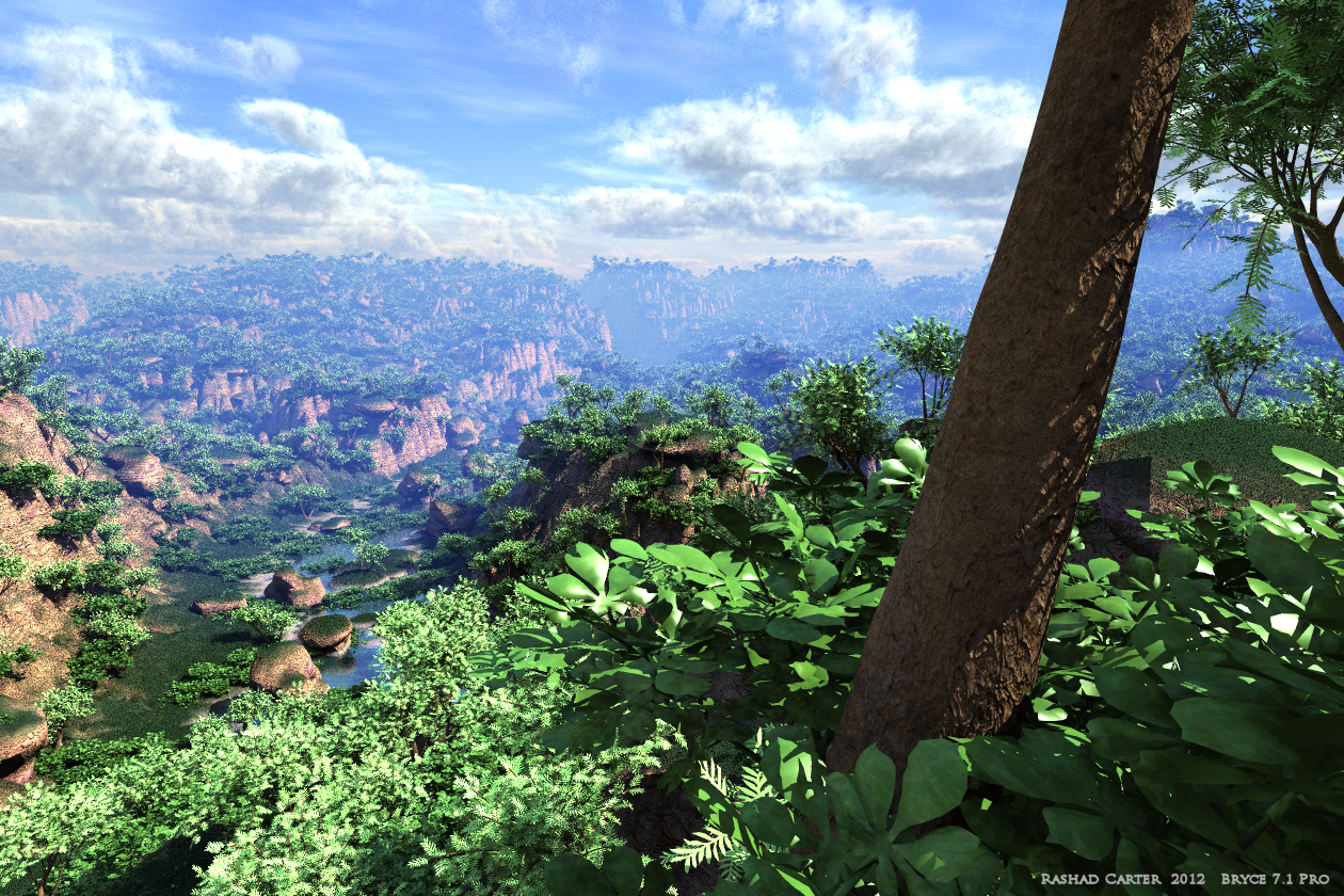
Green Canyons Sights
Just another camera angle on the fully 360degree world of the scene. Typically I toss the director's camera around randomly until i find decent looking shots. I don;t have to worry about altering lights because the levels have already been worked out on a global level. So far I am liking the results if the EarthGlow Dome Light Strategy. Also, the extra blue in the green looks plausible in these close ups. But I might be wrong on that so please let me know. Feedback is greatly appreciated. Thanks all for your time.
Loading unique views5,573 unverified legacy hits5.0 archived rating2011-12-13 added
Comments 8
A conversation around the artworkSign in to join the conversation.
I think it's spectacular, i have spent a great deal of my time traveling to many diffrent countries and it reminds me of being slightly inland from the coast in the Phillipnnes.
Stunningly well made Bryce landscape. I love your plants. I guess this are carefully handcrafted Bryce plants? I can not say much about the light, because I missing the comparison between "usual" light and your approach, but I can say it looks perfectly and convincingly. All in all: Chapeau! 5 of 5
Это - конечно, большой объем работы и заслуживает большой оценки. Ваша Стратегия Плафона EarthGlow - очень сложная вещь. Однако, у меня все еще есть слишком много синего цвета в тумане и недостаточный желтый цвет в листве. Только для моего вкуса. :))
Rectangle... Horo, looks to me like a facet in the terrain heightmap. Something I've noticed, the gouraud shading does not work on the transitions between light and shadow regions, an effect particularly noticeable on Bryce stones.
When I mentioned "colour perspective", I meant the effect (in real life) not the control (in Bryce), sorry, I should have made that clear I was making an observation about what I see in the sky around here - which to be fair is somewhat grey most of the time.
Thanks Horo and David!!!!! I did not use Color Perspective to shift the sky hues. I used a slightly blue tinted haze color, around luminance of 180 out of 240 with a generally low saturation around value 40. I think the issue might come from the actual scale of the project, the inconsistencies and weirdness of the Haze effect are quite pronounced at these extended scales. I think I would need to apply a deliberately warm haze color, maybe tan, to fight against the natural tendency of blue shift. I am probably using a little more haze than necessary, I want to convey the sense of scale, and without the haze these trees start looking a lot like short bushes. I really want better control over Haze in Bryce. Maybe for the next version. I'm going to keep working on the atmosphere. I feel I need to get this right. The jury is still out on the saturation and blueish tint for the vegetation. Sometimes I look at the render and it looks fine, then other times it looks like total crap. Very odd feeling I am having, I usually know exactly what I want, but this time I just cant decide. I was thinking this might be in a place like Indonesia, where you can have lots of different landscapes overlapping. I think Horo is correct, the rainfall amount here rivals that of a rainforest.
From the saturated green and the considerable amount of haze, I presume this is set in the tropics where the air is humid and there is rain frequently - this is supported by the clouds. In such a case, I can readily accept the saturated green foliage. I concur with David that this composition is more interesting than the previous one. I can imagine being there, having these plants around my feet and looking in the distance. The clouds at left play a trick on me, they look as if they would bend down behind the hill. Like on the previous picture, I see a slight colour mismatch between haze and perspective. Top marks nonetheless. Question: what is that rectangle right of the tree trunk?.
This shot is excellent. For me, better than the previous one for compositional reasons. The sense of scale is very good, something I've struggled with myself on many occasions. No fault with the lighting as far as I'm concerned. My criticism would be I find it very difficult to accept such highly saturated greens (but consider I live in a grey county) I've seen photo's from other places in the world where the foliage looks unbelievably saturated. So I wouldn't worry so much about that. The only thing then I would question, is the blueness of the haze in the distance. Not because of the blue itself, but because it does not match the grey of the clouds that appear to be either at the same distance or behind it. In my own observations, the clouds and the colour perspective on the atmospheric haze tend to converge in hue whereas though in your scene they do converge in lightness they hues remain noticeably different. Which is only a minor point, but since you wished for criticism, I offer it up for your consideration. But, that aside, do bear in mind I consider this scene to be an amazing achievement and demonstration of skill using Bryce. 5/5