FROM THE COMMUNITY COLLECTION
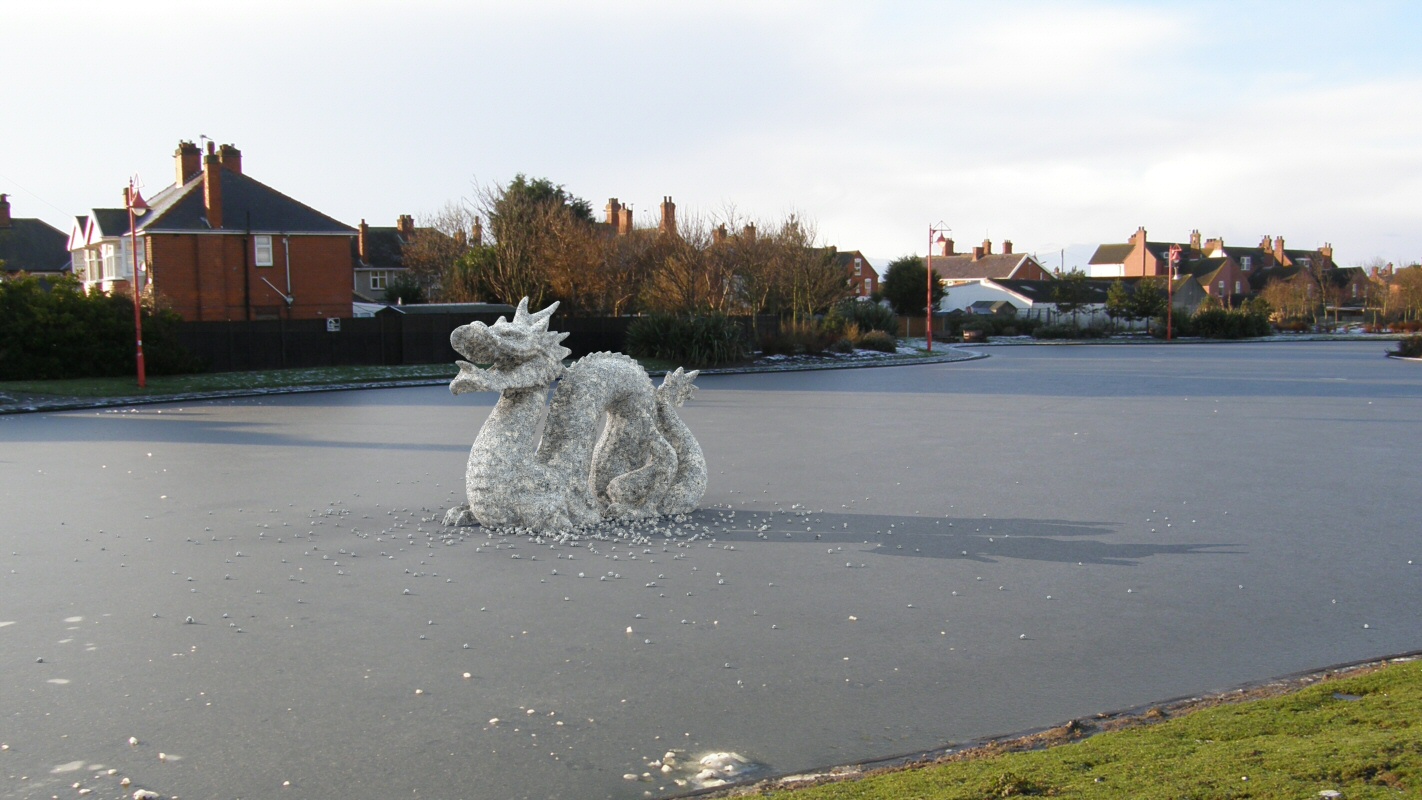
Stanford ice dragon
Featuring the Stanford dragon from the Stanford repository http://graphics.stanford.edu/data/3Dscanrep/ supplied and converted by Graham Dresch. Here in a bit of shadow capture fun. A photo of the local boating lake suitably frozen is used as a backdrop.
Loading unique views5,174 unverified legacy hits5.0 archived rating2012-01-09 added
Comments 11
A conversation around the artworkSign in to join the conversation.
Aye you are right it could have done with being more bluish. I think maybe it is something to do with the grazing angle reflections of the sky, the shadow in the foreground were less blue. I should have gone in between the two to be more accurate or just gone for blue to make it fit in better.
I agree its amazing. Just one observation: The shadows in the photo are more blueish and the dragon's shadow...
Thank you Rashad, Electro-Elvis, you are both correct. I did not consider postwork because I wanted to see how far I could get with Bryce. Shadow problems and colour, accepted, this can be adjusted possibly with tinted HDRI and tinted ground response from the shadow capture - but it is fiendishly tricky to arrange. I might try again when I have another suitable subject to trial. The ice is not transparent simply to rein in the render time. It would be possible but only at the cost of a huge hike in what is already quite a sizeable render thanks to the shadow capture surface which has to be transparent too.
The first thing that astonishes me is the fact that there are frozen rivers in Britain. ;-) The dragon does perfectly fit in the photo. You could believe it was really there. The only two tiny flaws I could tell, if I were a nitpicker are: The shadows in the background have a faint blueish appearance which I miss a bit in the shadow of the dragon. And the second is I am afraid the material of the dragon looks IMHO too less icily. I would expect a bit transparency. But of course unlike you I have never experienced a real frozen river therefore I could be totally wrong.
I guess its okay. Ive seen better. Just kidding. This is stunning. Perfect isn't even the word for it. If I was to be a petty small and troublesome fly, I would say there are three minor issues probably adjusted in post work that could make this virtually indistinguishable. 1. The shadows cast by the 3d items are slightly too dark near the bases of the geometries. 2. The shadows in the backdrop seem to have a slight blue tint, indicating there was some clarity to this sky that may have been lost in this backdrop. tinting those shadows just a smidgen blue will help. 3. Some sort of blurring could be applied to the main figure, to help it integrate better with the slight softened focus of the backdrop. Seriously, this is the type of render that gets attention. You could have parked a car in that lot with a girl washing it, and it would have looked realistic enough to fully suspend belief for several moments. Full marks!!
I understand Stephen. This is me by mistake copied from Google translator. :))
Thank you Alexey, Stephen... Thank you Alexey again, Stephen again!
Alex- it means everything is perfect.
Comment: That's very cool David, everything is spot on,
That's very cool David, everything is spot on,
Already seen in DAZ, set perfectly.