FROM THE COMMUNITY COLLECTION
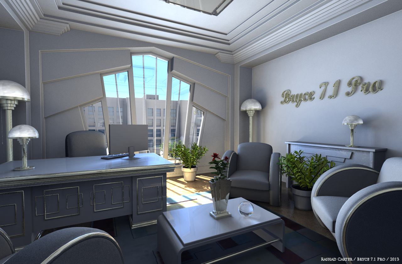
Deco Interior Scene White
The exact same camera angle as before, but this time with updated materials and some minor tweaks on the lighting. I think the scene holds together better, as there is less of a stark contrast between the background and the foreground. Thanks all for your time. Feedback is appreciated.
Loading unique views10,390 unverified legacy hits5.0 archived rating2013-02-25 added
Comments 5
A conversation around the artworkSign in to join the conversation.
This is what I call a killer render! everything is in good place from the lightning to the objects that fit so well in this scene.. I particulary like the way the sunlight hit the windows, it look so real!! Well i should be working on my next bryce project be for the moment I'm just speechless with admiration for this artwork.. Five stars for the star of course.
* A nice example of how colors can change an image. I personally like the black facility more. The contrast in the image, it brings more to live, and you look at it intensely.
I prefer this one because that light on the underside of the window frame has disappeared. To be fair, the previous render looks more photorealistic. Without additional lights, you had to photograph this scene as HDRI to make it appear this way. But the eye would perceive it this way and that's why I find this render more realistic (but less photo-realistic).
* This render concedes nothing to the previous. Only various materials of furniture. It's cool!
I am afraid, I like the version with the black furniture better. It is much more art deco ;-) But of course is the decision of the artist and beside your scene stays great anyway!